Running Times: Feature Article Design
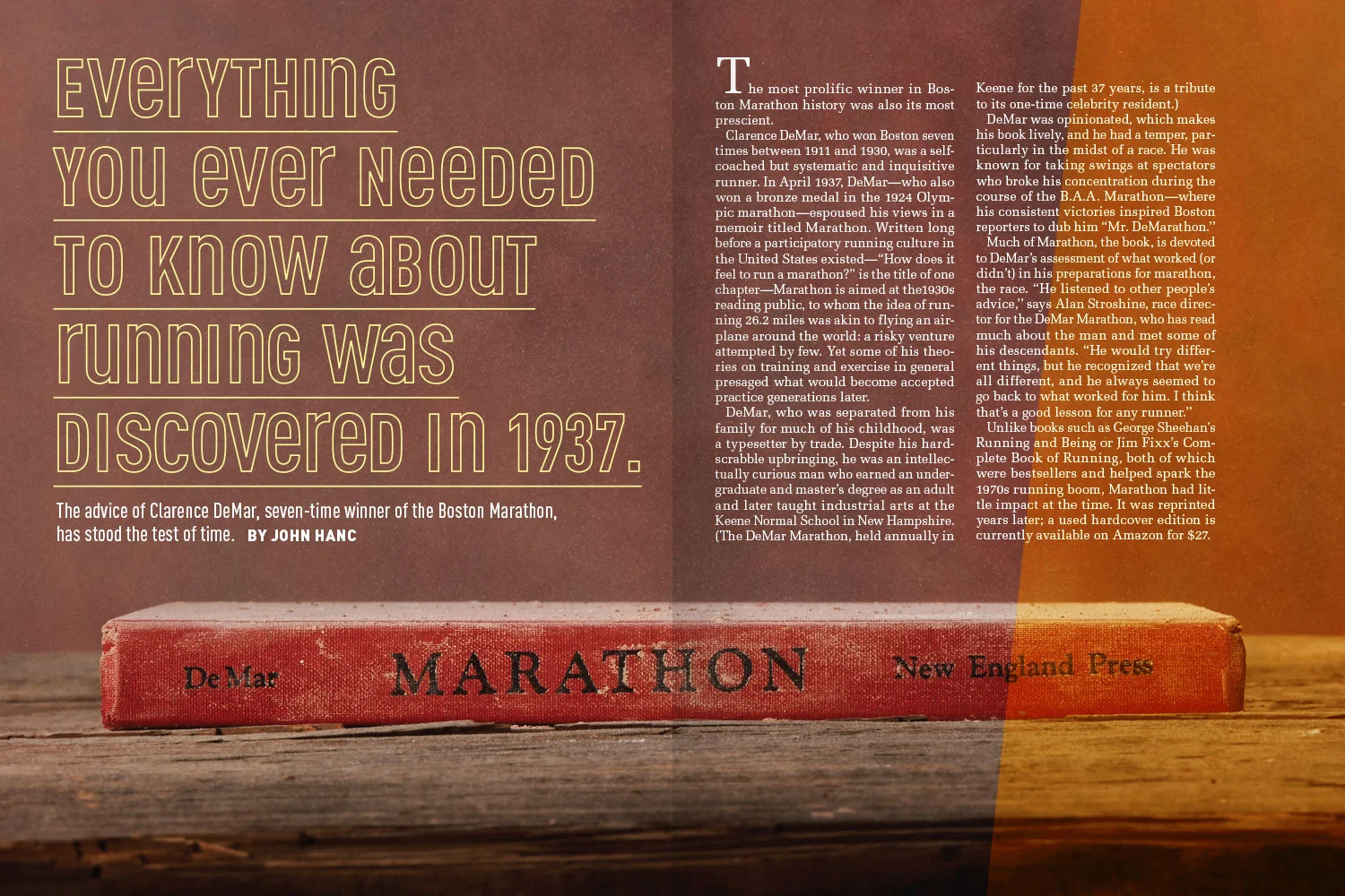
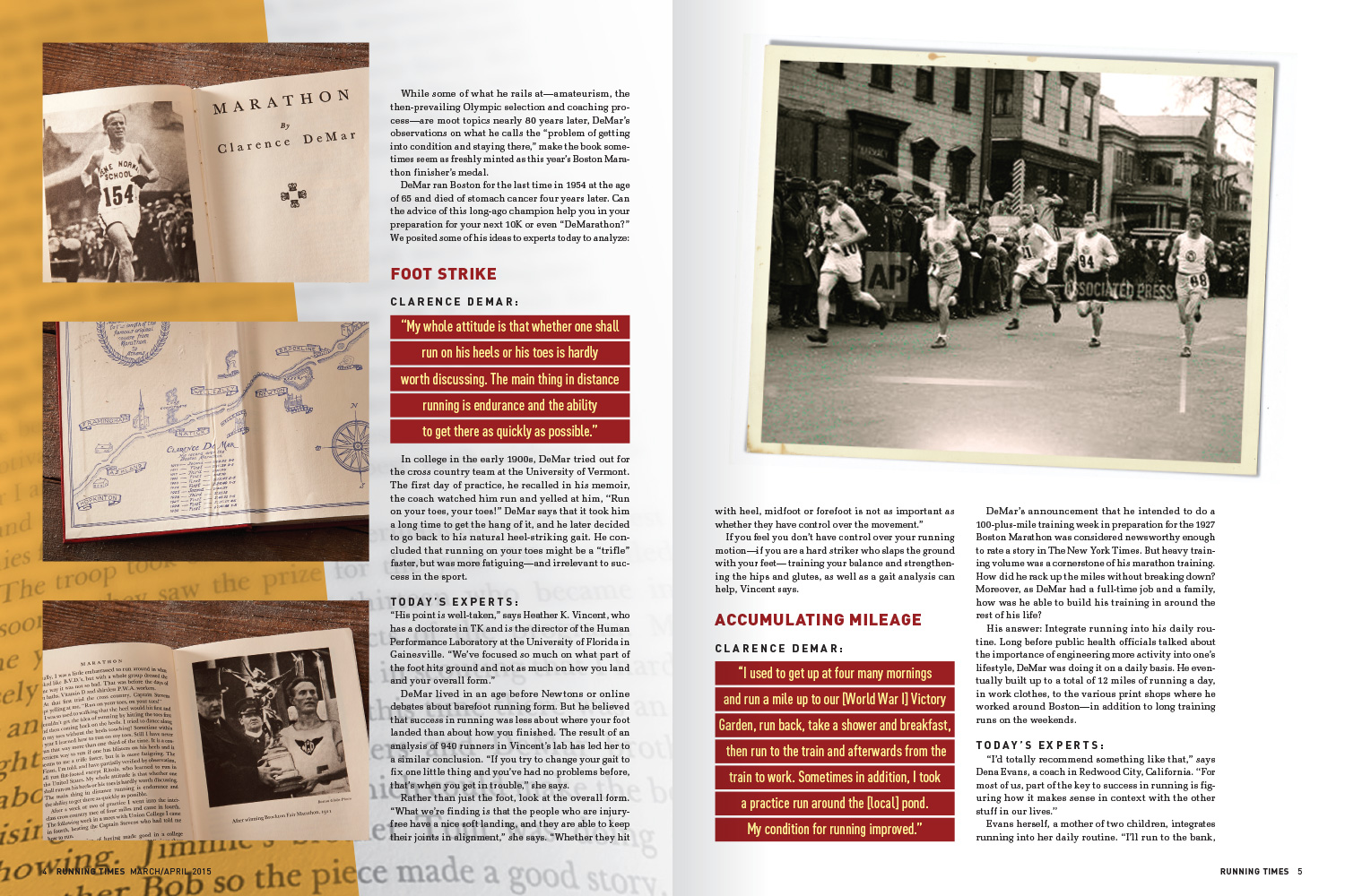
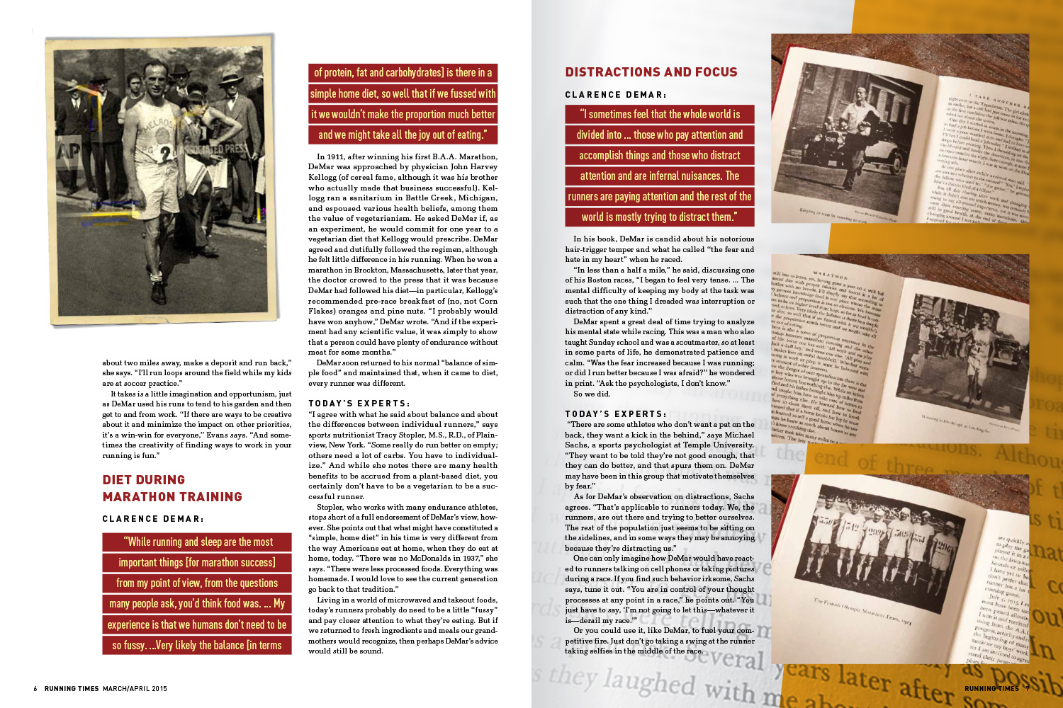
Running Times was running out of time to meet their deadline on a recent issue and turned to Carling Design to help close the gap by knocking out a couple of features in as many days. This “what’s-old-is-new” feature story showcased the compiled wisdom of a 1937 book by veteran Boston-marathoner, Clarence DeMar. Studio shots of the book and AP photos of DeMar were provided. “DIN , a German sans serif from the 1930s, was happily RT’s standard display font and I used variations of it to create a monoalphabet (a Bauhaus brainchild) for an interesting, vintage title. I wanted the AP photos of the author to have an artifact-look so added borders scanned from old family photos.” The vintage feel is extended with a palette of warm reds and oranges.
““With Carling Design, we know two very important things: First, we always get quality design consultation. And second, we have someone we can count on. Tom’s design solutions are always fresh and the workflow is as seamless as with our staff designers.” ”