


Readers for Bedford/St. Martin’s
Anna Palchik, Senior Art Director at Bedford/St. Martin’s, wanted Carling Design to bring a trade book/magazine feel to their college-level readers. Here are some examples of the many engaging interior designs Tom has created for B/StM.
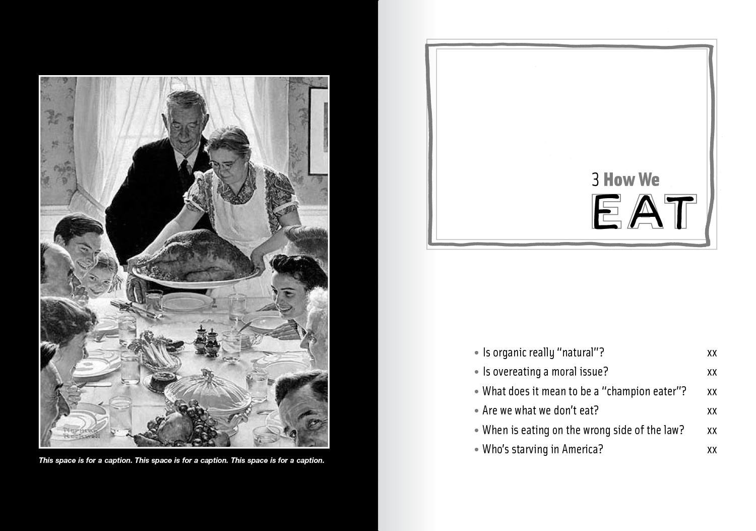
Acting Out Culture: AOC challenges students to think about the ways in which they conform to the “rules” of consumer society. “I wanted to echo the theme graphically with a ‘coloring within the lines’ concept.”
Writers Presence: “We would like a fresh, contemporary, but classic design.” This directive from Bedford/St. Martin's for Writer’s Presence, is paraphrased, in one form or another, in nearly every design brief Carling receives. “‘Of today, yet timeless.’ Oxymoronic? Not really. I know what they want.” Tom’s take on this injunction was greatly aided by the addition of a second color.
Ways of Reading: The redesign memo WOR bandied about phrases like “cutting edge”, “intellectually hip”, “typographically interesting” and, of course, the cautionary: “but not intimidating”. “Though initially challenged by some of my design ideas (curved text blocks!), it was readily agreed in the end that all criteria had been happily met.”
““Tom has been an absolute delight to work with. His design solutions are always fresh, creative, and distinct. I have used him for 6 different projects and not only was I very pleased with the results, but the editors also remarked on how attentive he was to the project and how wonderful both the process and the end product was. Tom is simply unflappable. Never one to get frustrated when given difficult requests; he works until he gets it right! When I make presentations of the books that our company produces, I always show the books Tom designed as examples. I recommend Tom Carling highly. He listens, he hears, he creates great solutions.” ”